
Health inequalities are avoidable and unfair differences in health status between groups of people or communities. They can include inequality in health outcomes by socioeconomic status or level of deprivation, or by characteristics such as gender, ethnic group or sexual orientation.
They also reflect historic and present-day social inequalities in our population, and reducing them should allow everyone to have the same opportunities to lead a healthy life.
PHE’s Health Profile for England 2018 reported that people in the least deprived parts of England live, on average, 19 more years in good health than people in the most deprived areas of the country.
It also reported wide inequalities in the health of children and in the wider determinants of health: the social, economic and environmental factors which influence people’s mental and physical health.
To support national and local action to reduce such inequalities, PHE has recently published updates to two tools: the Health Inequalities Dashboard and the Segment Tool.
Inequalities in life expectancy are widening, and there is a mixed picture of progress for other key indicators
The Health Inequalities Dashboard shows trend data for inequalities in life expectancy, and for 17 other indicators of health and the wider determinants. These are the key measures selected by PHE to monitor progress in narrowing inequalities within England.
For all indicators, the Health Inequalities Dashboard quantifies inequalities within England as a whole, and now also includes data on inequalities within local authorities for 4 of the 18 indicators. More data for local authorities will be added over time for as many indicators as possible.
The dashboard shows that inequalities in life expectancy have widened for both sexes since 2011-13. The gap between most and least deprived is over 9 years for males and over 7 years for females. Inequalities in healthy life expectancy are even wider and have not changed since 2011-13.
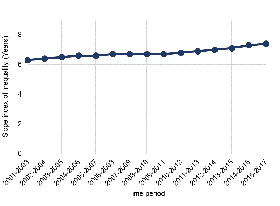
Trend in inequalities in life expectancy, females, England, 2001-03 to 2015-17. Source: PHE, Health Inequalities Dashboard
Inequality in premature mortality rates from cancer and circulatory disease (aka cardiovascular disease) have also widened in recent years. Mortality rates for deaths under age 75 in the most deprived areas are twice as high for cancer and four times higher for circulatory disease than in the least deprived areas.
There has, however, been a narrowing of inequality for some wider determinants of health, including children living in low income families, young people not in employment, education or training, and the employment gap between those with a long-term health condition and the overall employment rate.
Mortality from cancer, circulatory diseases, and respiratory diseases are key drivers of inequalities in life expectancy
The Health Inequalities Dashboard shows the gap in life expectancy within every local authority and the Segment Tool provides information on the causes of death and age groups which are driving those gaps. Targeting the causes and age groups which contribute most to the life expectancy gap should have the biggest impact on reducing inequalities.
Almost two thirds of the gap in life expectancy between the most and least deprived areas in England was due to higher mortality rates from circulatory disease, cancer and respiratory disease in the most deprived fifth of areas compared with the least deprived fifth. This reflects the wide inequalities in premature mortality rates from cancer and circulatory disease shown in the Health Inequalities Dashboard.
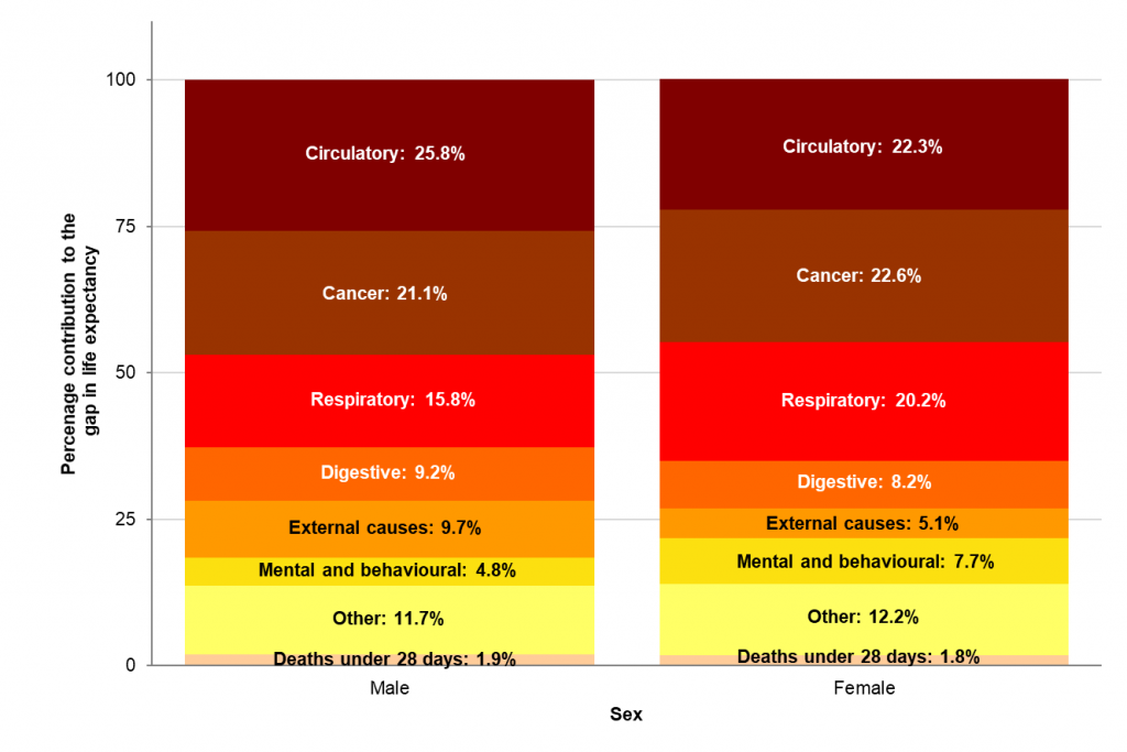
Scarf chart showing the breakdown of the life expectancy gap between the most deprived quintile and least deprived quintile of England, by broad cause of death, 2015-17. Source: PHE Segment Tool
The Segment Tool also breaks down contributions of a more detailed set of causes of death to life expectancy inequality, for example, the contributions of specific cancers. It can also be used to identify how higher mortality in the most deprived areas amongst specific age groups impacts on the life expectancy gap.
The tool provides this data at local authority and regional level. In many local areas, the key contributors to the life expectancy gap are the same as England – cancer, circulatory diseases, and respiratory diseases. However, there are variations at local level.
For example, the North East and North West regions have the lowest male life expectancy in England. However, the causes of death making the largest contributions to these gaps are different.
In the North West, circulatory disease, cancer and respiratory diseases contribute most to the gap in life expectancy between the region and England. However, in the North East deaths from external causes is the second highest contributor after cancer.
Higher mortality rates from external causes accounted for more than a fifth of the 1.6 year gap in life expectancy between the North East and England. External causes can include deaths from transport accidents and suicide, but in the North East it is deaths from accidental poisoning which are the largest contributor to the life expectancy gap between the region and England.
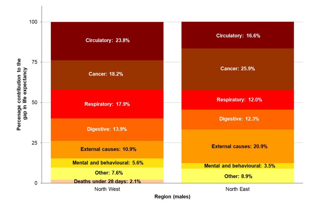
Scarf chart showing the breakdown of the life expectancy gap between selected regions and England, by broad cause of death, males, 2015-17. Source: PHE Segment Tool
What else is PHE doing to help local areas address health inequalities
PHE, alongside the Local Government Association and the Association of Directors of Public Health, will shortly be publishing guidance and resources to support place-based action for reducing health inequalities in local areas.
This will support new and existing joint action on health inequalities within local authorities, the NHS, and voluntary, community and social enterprise organisations.
Learn more through PHE’s segment tool and Health Inequalities Dashboard.
View original article
Author: Allan Baker