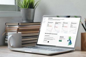
We’ve recently launched a refreshed dashboard design with some exciting new features.
The changes are in direct response to a survey of tens of thousands of our users. There was a lot of feedback, with one response running to more than 30,000 words!
But the main message was that people’s needs from the dashboard have changed as the pandemic has evolved. In the past you mostly wanted to know the totals, the numbers of cases and deaths since the pandemic began.
Now there is a far greater demand for the latest trends. So, with different local restrictions coming into force across the country, we wanted to give people the ability to understand the situation in their own areas in as much detail as possible.
So what have we changed, and why?
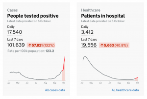
Introducing trend information
On the homepage the focus is now shifting away from total figures to a rolling view with recent figures and current trend information. Users can now easily see the figures for the last seven days compared to the previous week. We hope this will give people a much clearer idea of the direction various metrics are heading, and at what rate.
Increasing the amount and ease of finding local information
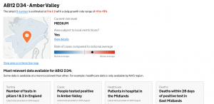
Another area we’ve been spending a lot of time on is improving the ability to find out local information and insights.
On the homepage you can now enter a postcode and receive a summary view for all the key metrics, with the most detailed level of data for your area.
We’ll also be adding more information to this page in the future to help users assess the risk level for an area, and to highlight any local restrictions that may be in force.
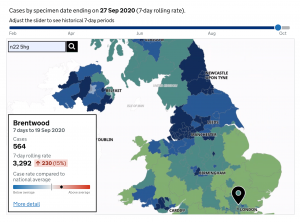
Maps make a comeback
Linked from the homepage our new map allows people to zoom into local areas to receive increasingly granular information.
By default, users are presented with the last available seven days of data. But by using a slider, it’s also possible to go back in time and observe how the pandemic shifted across the country.
And if you click on different areas of the map you can see information relevant to that region, local authority, or even smaller. This includes the 7-day total of cases or deaths, and the 7-day rolling rate. An indicator highlights how the selected area compares to the national average.
We’ve also made a few other changes to the dashboard to help make the page more accessible, including the linking to easy read documents from the homepage.
As always, please send us any feedback to [email protected] – we’d love to hear any thoughts and suggestions for how we can continue to improve the dashboard.
You can also find out more about the COVID-19 dashboard in this blog.
View original article
Contributor: Nick Jones